Don't miss our holiday offer - up to 50% OFF!

Creative Layout Techniques for Stunning Scrapbook Pages
Creating visually captivating scrapbook pages is all about crafting a layout that tells a story with personality, rhythm, and balance. Whether you’re documenting a heartfelt memory, a travel adventure, or everyday moments, the layout you choose becomes the foundation of your page. By combining composition principles with artistic touches, you can elevate even the simplest photos into a polished scrapbook design that feels cohesive and inviting. Exploring different arrangements and experimenting with techniques will help you discover a personal style that reflects your creativity while keeping each page fresh and engaging.
Understanding the Role of Composition
Composition determines how the viewer’s eye travels across your page. Mastering basic composition techniques offers a clear sense of flow and harmony that makes your scrapbook visually appealing. One popular approach is the rule of thirds, where your page is divided into three equal sections both horizontally and vertically. Placing focal points along these lines can make your design feel dynamic and balanced. Central compositions, on the other hand, work well when you want a clean and symmetrical look that emphasizes a single strong image or message.
Another aspect of composition is visual hierarchy. Think about which elements you want the viewer to notice first and arrange supporting pieces around your main focus. Larger photos, bold titles, or high-contrast colors naturally draw attention, so positioning them strategically can create a compelling narrative path. Layering embellishments, textures, and patterned papers around focal elements helps reinforce importance without overwhelming the layout.
Playing With Shapes and Framing
Working with shapes can transform the mood of your page. For instance, using circles creates a softer, more playful tone, perfect for family or childhood themes. Square or rectangular frames add structure and allow for easy pairing with geometric backgrounds. Mixing these shapes can create an eclectic and surprising visual experience that makes your layout stand out.
Framing techniques are equally powerful. Adding borders to photos can help them pop against busy paper patterns, while soft torn-paper edges introduce a handmade, artistic feel. You can double-frame images using contrasting papers to add depth or create peek-through windows in the page to highlight small details. Frames don’t have to be traditional—fabric scraps, lace strips, or even dried leaves can become unique framing elements that bring texture and personality.
Creating Dynamic Movement Through Layering
Layering is one of the most effective techniques for giving scrapbook pages dimension. By stacking papers, stickers, ephemera, and trims, you create movement and visual interest. Start with a background base, then build upward with mid-sized decorative pieces, followed by smaller accents or focal details. Each layer should serve a purpose, whether framing the photo, adding color, or guiding the viewer’s attention.
Using foam tape can lift certain elements, making them appear closer to the viewer and adding tactile depth. Transparent layers, such as vellum, can soften bold colors or add delicate texture. Layering doesn’t always mean adding more—it can also include strategic negative space. Leaving a clean area around a cluster of layered elements creates contrast that feels intentional and refined.
Experimenting With Grid and Mosaic Layouts
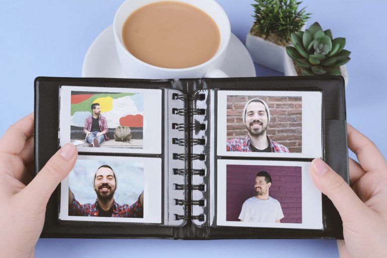
Grid layouts are ideal for organizing multiple photos without creating clutter. A simple grid can convey order and symmetry, making it perfect for documenting events or showcasing a sequence of moments. You can vary the grid by mixing photo sizes, adding handwritten labels between the frames, or leaving some grid squares empty for decorative fillers.
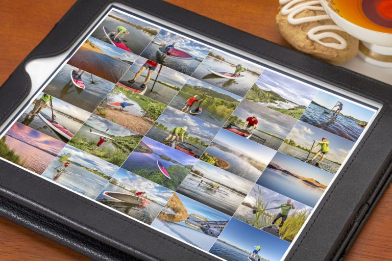
Mosaic layouts offer a more artistic interpretation of the grid structure. By cutting one large image into smaller pieces and arranging them in a mosaic pattern, you can create a dramatic effect that highlights texture and detail. This technique works beautifully for nature photography, travel shots, or any image with visual complexity.
Using Color to Guide the Eye
Color plays an essential role in shaping your overall layout. A harmonious color palette ties your elements together and enhances the emotional tone of the page. Warm tones like reds, oranges, and yellows evoke energy and warmth, while cooler hues such as blues and greens bring calmness and serenity. Complementary colors can add contrast and vibrancy but should be used sparingly to avoid overwhelming the composition.
Try choosing one dominant color and complementing it with two or three softer accent colors. You can pull shades directly from your photos to ensure cohesion. Color can also be used to highlight important details. For instance, placing a bright border around a key photo subtly draws attention without distracting from the rest of the page.
Emphasizing Storytelling Through Journaling Placement
Scrapbooking is not only about visuals—it’s also about preserving memories. Integrating journaling thoughtfully into your layout strengthens the narrative and brings personal meaning to your design. Journaling can be placed beneath photos, wrapped around shapes, or tucked inside hidden pockets for a more interactive experience.
Handwritten notes add warmth and authenticity, while typed journaling creates a clean and consistent look. Consider using tags, pull-out tabs, or small envelope pockets to make your journaling feel like a special discovery. The placement should complement the layout’s flow, supporting the overall design instead of interrupting it.
Adding Texture for Sensory Appeal
Texture enriches your pages by engaging both the eye and the sense of touch. You can introduce texture through fabric scraps, lace, burlap, ribbon, or textured cardstock. Even subtle textures such as embossed papers or raised ink patterns can make a big difference. Mixing smooth and rough textures helps create contrast and variety, making your page feel more dynamic and layered.
Another effective way to add texture is through dimensional embellishments such as buttons, wooden pieces, or metal charms. These elements can reflect the theme of your scrapbook and bring extra personality to your creation. Just be mindful of bulk if you plan to store your scrapbook in a tight-fitting album.
Balancing Creativity With Practicality
While artistic freedom is essential, practical considerations ensure your scrapbook remains functional and easy to browse. Heavy or sharp embellishments should be positioned away from delicate photos to prevent damage. Avoid placing thick layers too close to the album binding to ensure pages can turn smoothly. Maintain enough negative space to avoid overwhelming your layout—sometimes simplicity is the key to elegance.
Understanding the balance between creativity and usability helps you create pages that are beautiful, durable, and enjoyable to revisit. You can experiment freely while keeping practical design in mind, allowing your scrapbook to stand the test of time.
Developing Your Signature Layout Style
As you practice different techniques, you’ll naturally develop a personal style that reflects your aesthetic preferences. Some scrapbookers gravitate toward minimalist designs with clean lines, while others enjoy highly textured, layered compositions. Your style may evolve depending on your materials, themes, or creative mood. Embrace this evolution and let your scrapbook become a reflection of your imagination.


